Ambient UI Component Library
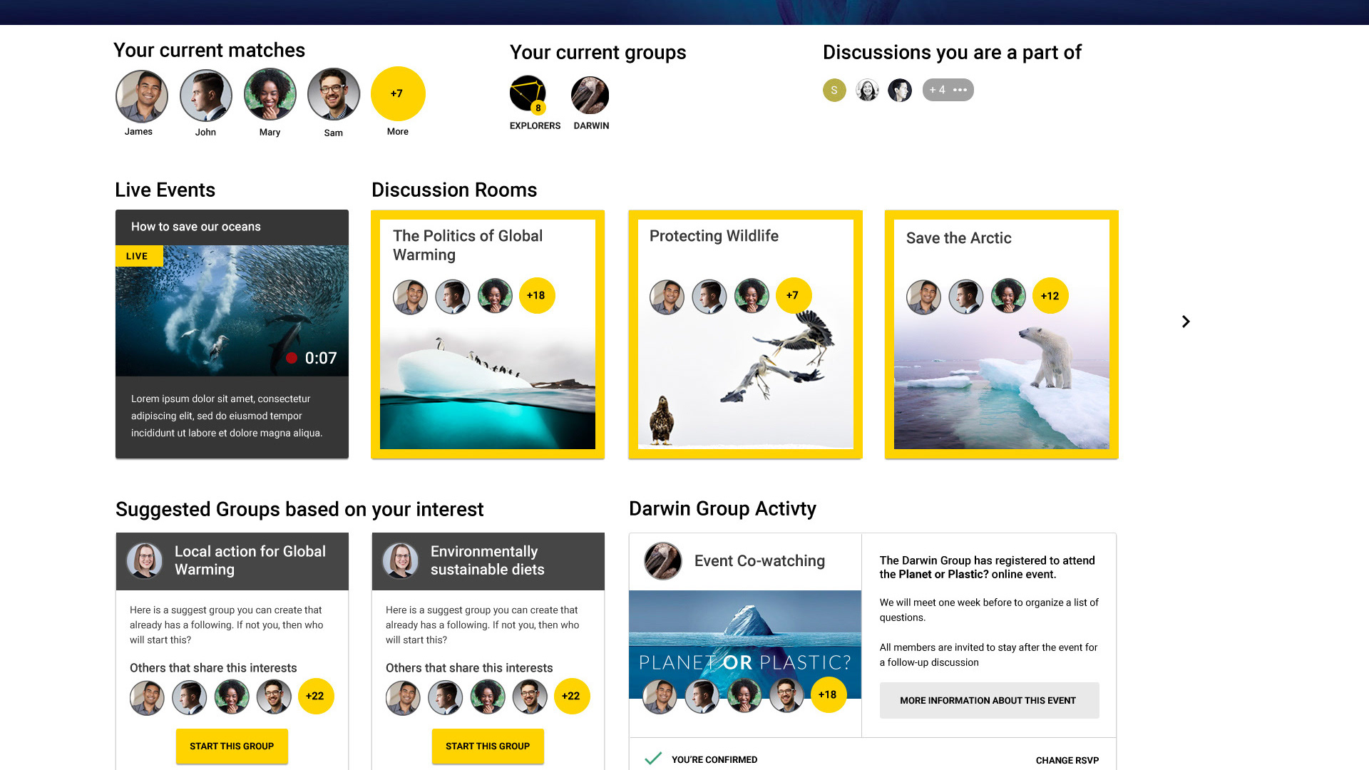
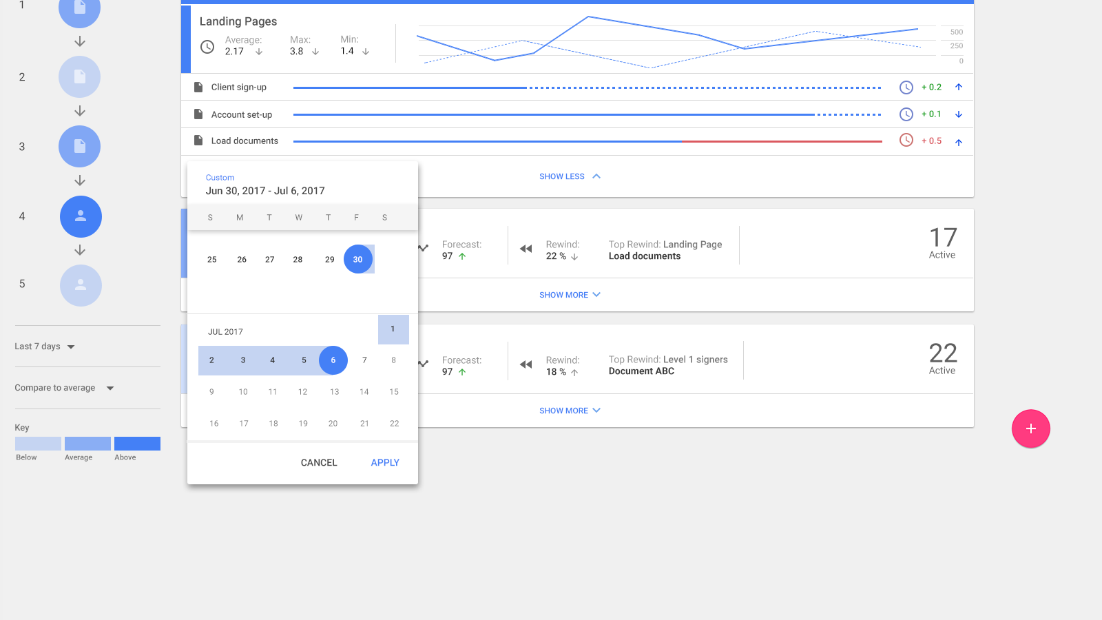
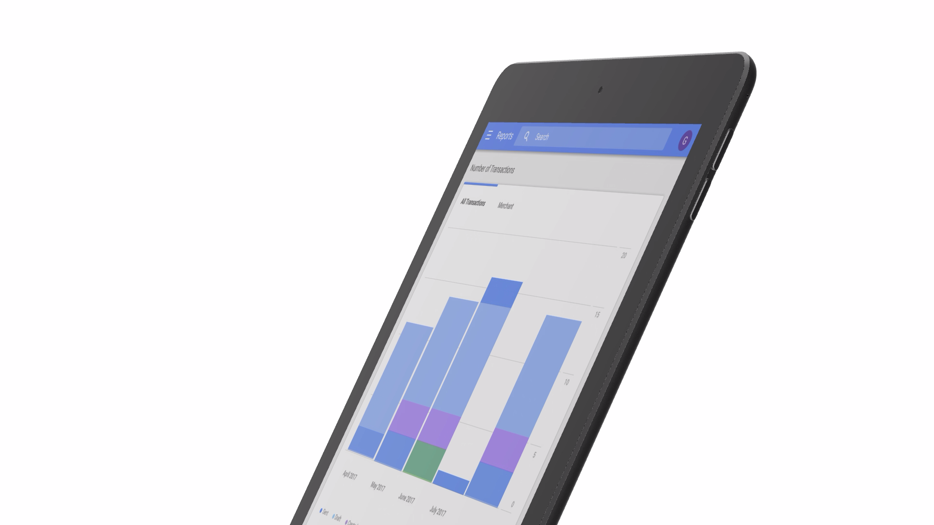
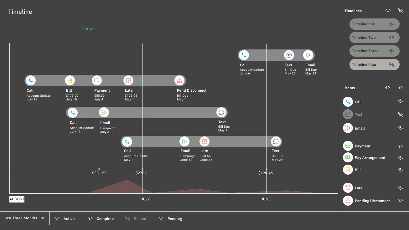
Below are examples taken from Ambient, the UI component library I created for Inoveris. The goal of the Ambient library was to unify design across Inoveris' diverse business units—including utilities, municipal software, parks and recreation, construction, compliance science, and more. z
Ambient's design philosophy is light and minimal, with purposeful use of color and subtle drop shadows to maintain a calm, "ambient" aesthetic. This library includes buttons, toggles, ellipses, nodes, complex components, and other essential UI pieces. z
I was responsible for every aspect of the library's development, including:
- Conceptualization and Design: Creating components and systems in Figma.
- Technical Implementation: Developing the library in Redux and React, then centralizing it in an npm package for easy adoption across business units.
- Collaboration: Managing structured meetings and creating documentation for a designer-developer handoff process to ensure seamless adoption and updates.
The library was continuously updated and served as a single source of truth for design and development, harmonizing projects across Inoveris' ecosystem. A sample of the designer-developer handoff process is also available in my portfolio.

