Dynamic Timeline for Enterprise Data Visualization
Problem:
Utilities and enterprise clients needed a flexible timeline tool to visualize complex customer data, such as payments, late fees, and service connections. The tool had to balance real-time accuracy with usability, accommodate varying screen sizes and data densities, and remain scalable across multiple use cases.
Utilities and enterprise clients needed a flexible timeline tool to visualize complex customer data, such as payments, late fees, and service connections. The tool had to balance real-time accuracy with usability, accommodate varying screen sizes and data densities, and remain scalable across multiple use cases.
Solution:
I designed and developed a fully custom, responsive timeline visualization system with the following features:
I designed and developed a fully custom, responsive timeline visualization system with the following features:
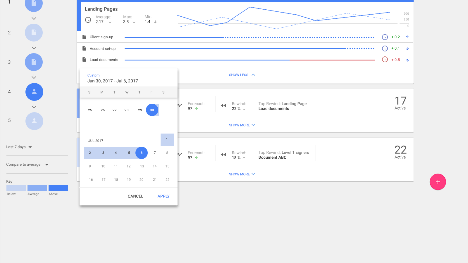
Adaptive Scaling: The timeline dynamically adjusts its detail level based on time range, screen size, and data volume. Larger scales reduce events to clickable dots, enabling users to drill down into specifics when needed.
Layered Data Views: Users could interact with multiple layers of information (e.g., payments, billing, and service interruptions) while maintaining a clean, intuitive interface.
Relative Time Representation: Ensured visual clarity by maintaining relative positioning of events, even during periods with sparse data, while avoiding distortion in real-time relationships.
Impact:
The timeline provided customer service representatives with an at-a-glance overview of client histories, improving response times and workflow efficiency. This system is now scalable for other enterprise applications, including industries with similarly complex data.
The timeline provided customer service representatives with an at-a-glance overview of client histories, improving response times and workflow efficiency. This system is now scalable for other enterprise applications, including industries with similarly complex data.
My Role:
Designed the concept and UI layout, creating an intuitive user experience for varying data scales.
Developed the front-end React application using only native code, transforming raw data into a dynamic and interactive timeline.
Delivered a reusable framework capable of supporting future enterprise use cases.

