Developer Handoff: Bridging Design and Development for Pixel-Perfect Results
The Challenge:
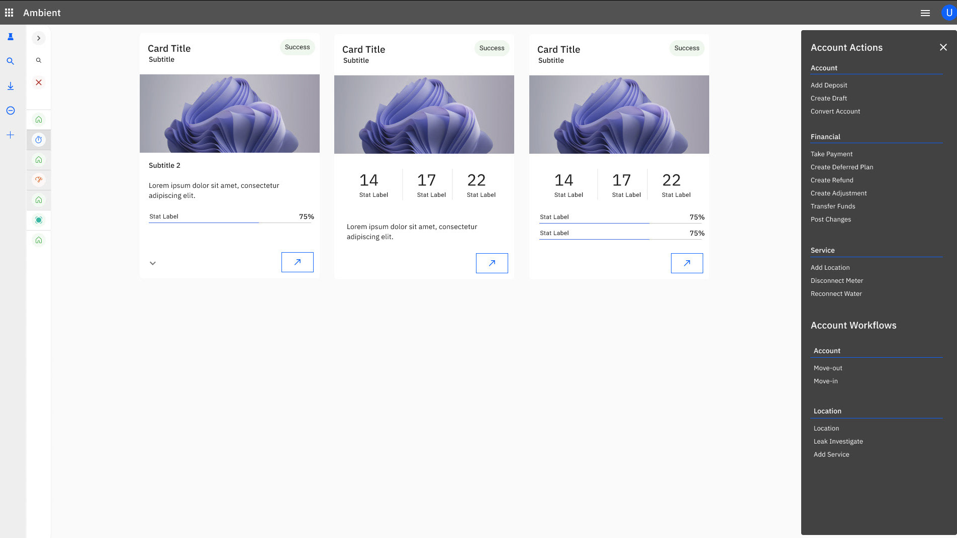
Many clients experience a disconnect between polished design mockups and the final implemented product, leading to disappointment and frustration. This gap often arises due to:
Many clients experience a disconnect between polished design mockups and the final implemented product, leading to disappointment and frustration. This gap often arises due to:
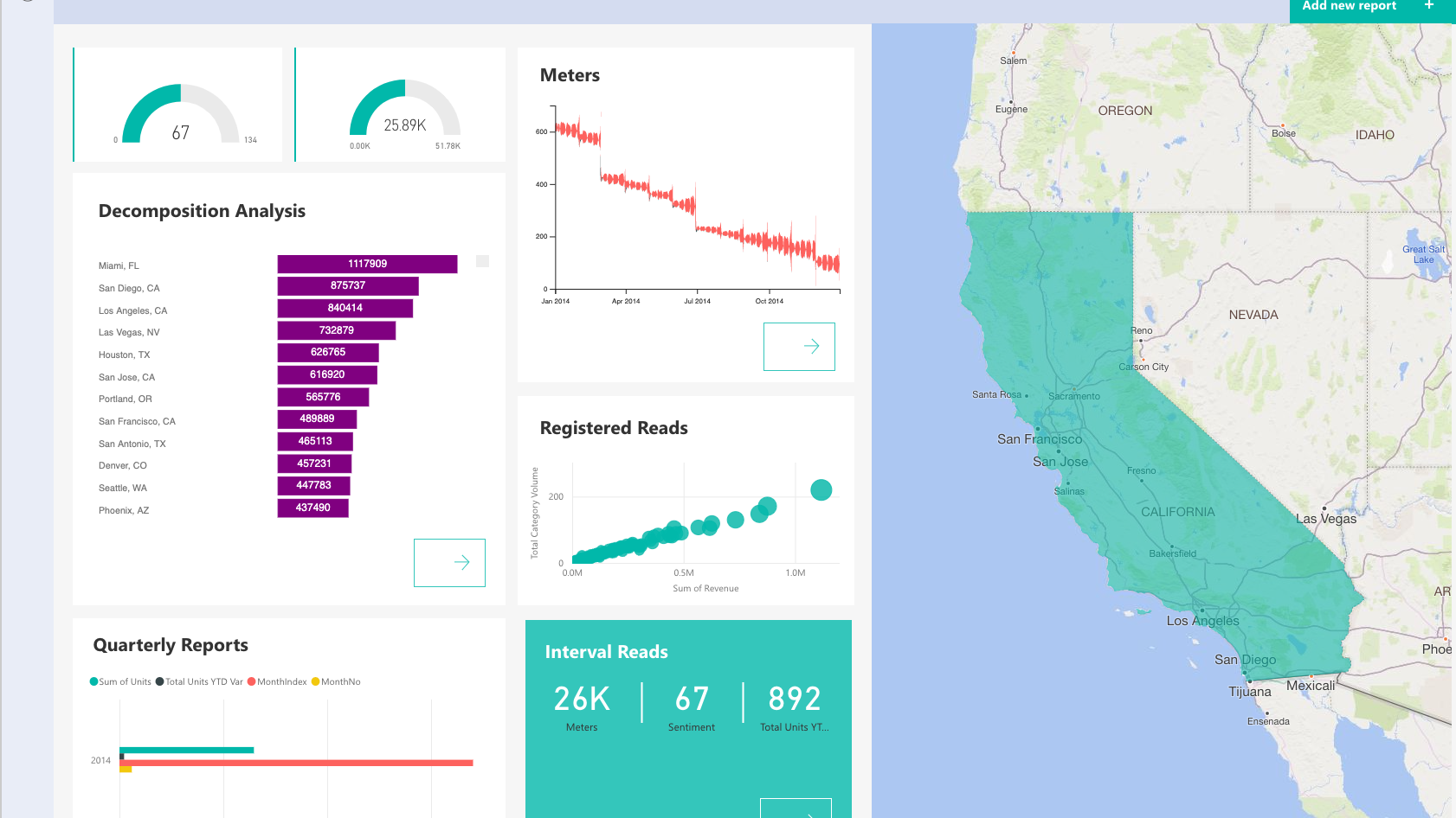
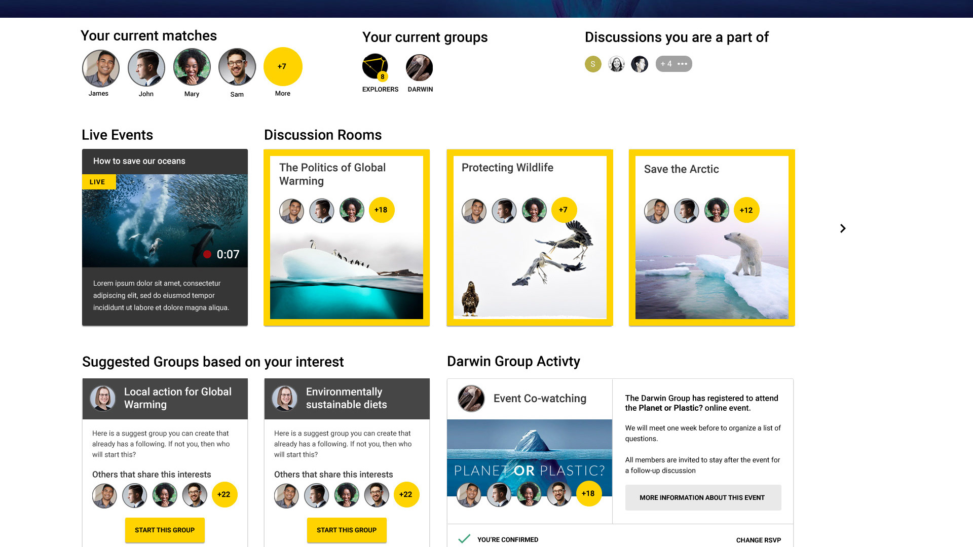
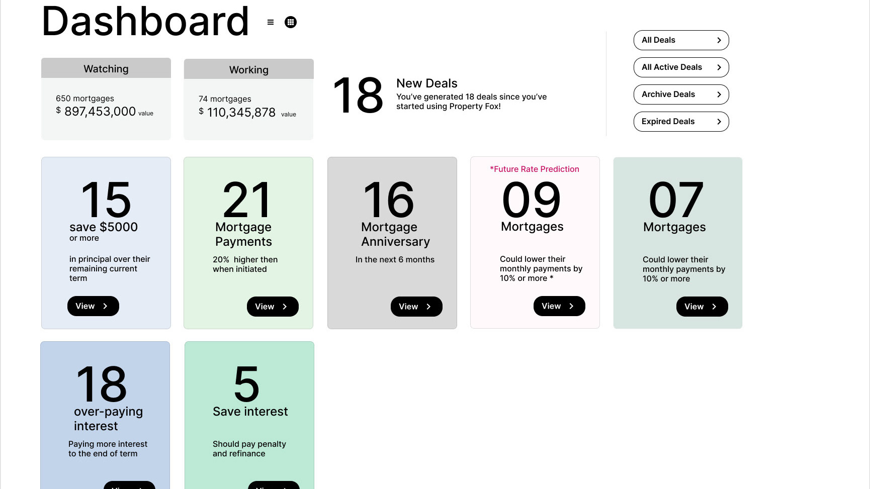
- Designers not accounting for real-world data variability (e.g., long titles, excessive data, or inconsistent visualizations).
- Developers deviating from design specifications, such as spacing and alignment.
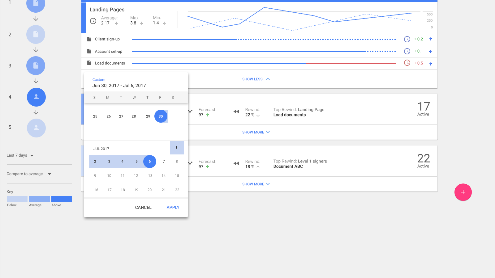
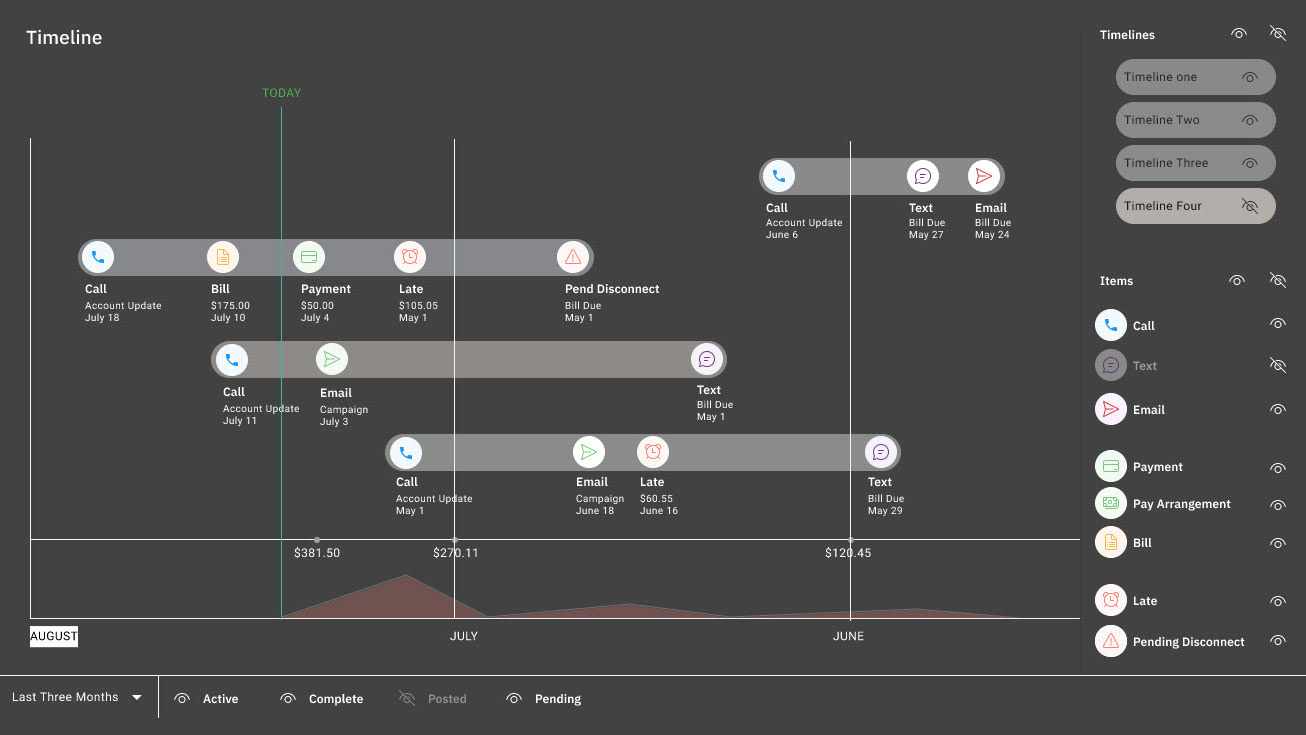
- Unrealistic design elements (e.g., data visualizations) that don’t align with technical or budgetary constraints.
- Developers deviating from design specifications, such as spacing and alignment.
- Unrealistic design elements (e.g., data visualizations) that don’t align with technical or budgetary constraints.
My Solution:
I created a comprehensive handoff system that aligns design and development workflows to achieve pixel-perfect results. Key elements include:
I created a comprehensive handoff system that aligns design and development workflows to achieve pixel-perfect results. Key elements include:
Data-Driven Design:
- Use real sample data during the design phase to account for variability in content and visualizations.
- Select and test visualization libraries early to ensure feasibility within technical and budget constraints.
- Use real sample data during the design phase to account for variability in content and visualizations.
- Select and test visualization libraries early to ensure feasibility within technical and budget constraints.
Integrated Design-Development Workflow:
- Built React components with spacing props that mirrored Figma variants, enabling developers to easily apply consistent spacing (e.g., small, large, extra-large).
- Ensured naming conventions for React components and Figma elements matched exactly, streamlining troubleshooting and collaboration.
- Ensured naming conventions for React components and Figma elements matched exactly, streamlining troubleshooting and collaboration.
Handoff Documentation:
Developed detailed documentation that mapped Figma components to React components, illustrating how base components, subcomponents, and nested components interact.
Included specifications for elements like action buttons, icon colors, and spacing units, showing how design principles translate directly into code.
Impact:
This system ensured:
This system ensured:
Consistency: Pixel-perfect alignment across design and development, even with complex nested components.
Efficiency: Faster implementation by reducing guesswork and enabling developers to work directly from clear, pre-defined guidelines.
Scalability: A reusable framework for future projects, with tools to handle both design and real-world data complexities.
What’s Shown:
The handoff document highlights examples such as the Icon Action Button, showcasing its specifications, subcomponents, and spacing units. It also includes a React component example and explains how design systems like spacing scales integrate seamlessly with production environments.
The handoff document highlights examples such as the Icon Action Button, showcasing its specifications, subcomponents, and spacing units. It also includes a React component example and explains how design systems like spacing scales integrate seamlessly with production environments.

